Evaluation

During my time planning, researching and filming I have spent many hours trying to create a professional look to my products. Especially the poster and the magazine, which are the selling points of the product.


In the trailer, my main idea at first was to portray Sean as a normal man who lead a double life as a hitman. He wanted to break free from his 'gory' lifestyle and wanted to get on with leading a normal life.
Then the concept changed completely when we finished the first scene, which was Sean eating breakfast and reading a newspaper. We wanted to create a film about emotional separation and the second life he leads as he goes on a murdering rampage. Much like a modern day Jekyll and Hyde but with Hyde working as a hitman.

I used a video and pictures from my mobile to give feedback, then I decided to put it on the blog and type my evaluation of the feedback. I also took pictures of the feedback being wrote down while showing the Trailer. I didn't want to be conventional and use powerpoint presentations or type up what feedback I got. Instead I wanted to show my feedback by pictures and videos.

My audience feedback has given me a lot to think about, especially what is good about the product, such as the strengths and what is bad about the product. I used sticky pads for my audience to write down their thoughts on my product. I thought it was a good idea since they could add information and then stick it to the product so it could be organised properly. I learned from my audience feedback that some of the images, shots and angles I have taken are brilliant and professional, which is what I want to achieve. I have also learned that it is acceptable to have a few weaknesses on your product, as it gives you something to overcome the next time you try. The colours that I have done for the Magazine did not match, which I agreed on and changed to a suitable, legible font and colour.

I think that the Trailer does coincide with the poster and the magazine and all together gives it a professional look. The font for the Magazine and the Poster matches as well and the same main protagonist is used in all products.

Feedback for Magazine


All of the feedback received for my Magazine said that the font was either illegible or the colours did not match. I decided to change my magazine a bit, using a colour scheme. Since then I have edited my magazine cover and changed the font and colours to see if it made any difference. I think it looks much better now. (See below)

Feedback for Poster


Based on the feedback from my poster, I have received mix views about how professional the poster is. Some have said that the font does not look professional and others have said it looks professional because the font and image has a good layout. I will try to take that into consideration and I might make a quote to go with the image as a tagline to attract an audience as well.

Feedback for Trailer

This was my feedback for my Trailer. The music I have used for my second draft fits with the theme of the trailer. Everyone like the font and the music and thought it matched. Someone commented saying that it needed more camera angles and that the font was bright. I will take that into consideration while editing it again.


I obtained the feedback by setting up my computer (As above) in a classroom and letting my peers from the A2 Media group assess it by watching it and writing what are the strengths and weaknesses of the trailer. 

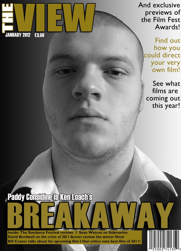
Magazine - Final Version?

This is the magazine so far. I like the mast for the magazine and I think it looks professional. I am not too sure on the colour of the writing and how it has been placed to the right. I think it may be finished soon and I am going to try and get some feedback from this and the poster. I will get a group of AS Film students to asses the poster and magazine.

Poster - Final Version

This is the poster to coincide with the film trailer and magazine. I have used a black border around the photo taken and a red filter with white writing. I tried to create a simple poster that is as effective as a big budget film poster.

Trailer - Final Version

This is the final version of my trailer. I added a few scenes to further represent the separation of Sean and society and then I added another scene that depicts a murder scene is about to happen. I also changed the music to sad dramatic music. This is to set a feeling of sympathy for the protagonist and his problems. I want the audience to have a negotiated reading, that they do feel sympathy for the protagonist yet they think it's wrong of him to kill the innocent as a hitman. 


Background music has been changed to be more sympathetic yet chaotic and confusing at the same time, this could create suspense for the audience so they want to know more about the product. The music used is Forgotten September by Two Steps From Hell, a soundtrack production company that has produced music for blockbuster movie trailers such as Harry Potter and The Deathly Hallows Pt. 1.


I do understand that in the trailer, there is no clear representation of British Crime happening apart from the two violent scenes, but it is set in the industrialised England scenery and Sean is referred to as a hitman in the plot.

Locations

I am going to use a few locations for my Trailer but for the magazine and poster, I want a white background so anywhere with a white background will do.


These are a few ideas of what I would like to include in my film.


The Bridge Scene
I want to use this location for a murder scene. The bridge gives access for a high location and the audience assumes when Sean grabs a character that he will throw him off the bridge. This gives the Trailer some tension and excitement.


Inside of Sean's house
This is for use during the breakfast scene. I think it will create a calm and 'normal' atmosphere for the trailer. This could contrast against the bridge scene that has a murder. The protagonist could be sitting reading the newspaper, watching television or eating lunch or breakfast. This creates an everyday life atmosphere.

Bede College corridors
I am going to use a colleges corridors for one scene as a representation of the separation of the main protagonist and society as two characters will nudge past him in the corridor. The main character will show no remorse for his actions and continue walking. 


Although Sean is portrayed as an adult, the setting for the trailer is not actually a college, I wanted to create a scene of social deprivation for the protagonist so I used a suitable corridor scene.

Trailer - Editing and the Program

The program I am using to edit my film is Sony Vegas Pro 10.0. I am almost finished editing the final versions of the Trailer. I have used features such as Media Generators and Fade in Vegas to create a professional effect in the Trailer. I prefer Sony Vegas over Adobe Premiere Pro because I am used to it and it is less confusing for me. Although Premiere Pro has more features, much of the features can be added with After Effects or other similar programs.

Trailer - First Draft

This is my media trailer. It is the first draft so I'm looking to improve it. I don't think the music matches with the genre and I have spoken with my lecturer and she said that I should change the music and add another two scenes as the storyline is a little confusing. I understand that the storyline is confusing as it only shows Sean eating at a breakfast table and him beating someone up. I wanted to include a scene where he bumps into two people and they look at him in disgust, this will show his detachment from society. And another scene where he is trying to fight a teenager over a bridge. This could build up the tension for the trailer and anticipation of the fight scenes and deaths.

Ideas for soundtrack


My ideal soundtrack would be using music track from the Two Steps From Hell production music company. They have realeased three public albums as of now and I am currently reseraching which music would go with the film trailer. I want the music to be dramatic but just to an extent and with paced rythym. I am also looking at how to contact the composers so I can request permission to play it for my trailer. I will choose which music is appropriate, then ask for permission to play it, and then buy the track or the album.

Target Audience

The target audience for my products is aimed towards people who enjoy british crime dramas. The audience would be class D to C1. I don't think class E should be included as our target audience because I think that pensioners wouldn't be interested in our films. I want the audience to see how Sean is portrayed and to get across the idea that he lives two lives. The trailer does state in some captions that he wants to break free from the bad side of his life and live a normal life. The audience may want to watch this for escapism, to escape from reality or for drama and  general entertainment.


The target audience could also be a male orientated audience who can relate to Sean as a marginalised male, stuck between the chaos and complications of life, or it could also be watched as an escapism from their own problems. The products would satisfy this audience using a similar marginalised male who they can identify with or possibly use the character as an outlet. By doing so, I attract a certain type of male from Connells Masculinities and by word of mouth, the product could become popular.